


When an economic recession occurs, one thing that happens for sure is the unemployment rate goes up. You can see a graph of the California unemployment rate since 1967 on the St. Louis Federal Reserve Bank’s website. Below is a copy of that graph until 2019-01-01.
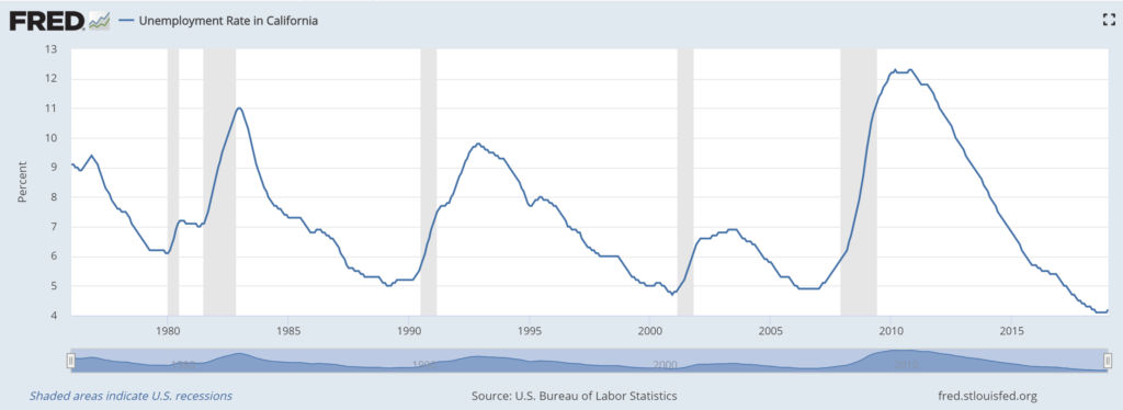
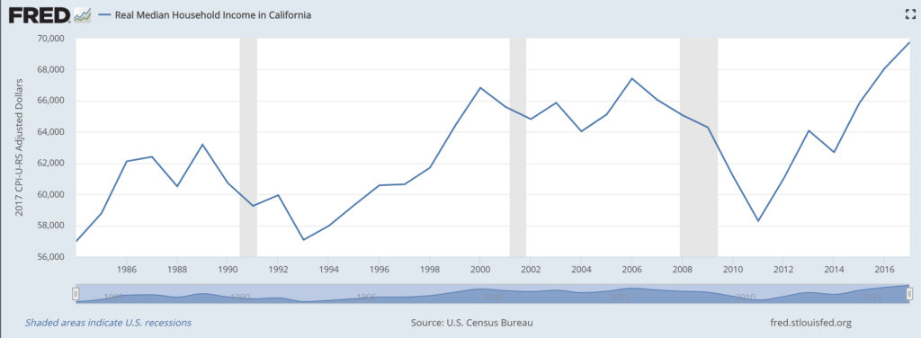
The shaded areas indicate a recession. As you can see, the unemployment rate has jumped up during each recession. Logically, as unemployment goes up, incomes go down since fewer people are working. Following is the graph of real median household income in California over the years.
So how do you know when a recession will occur. It turns out that the best indicator of a recession is when the Treasury Yield Curve inverts.
You can see a graph of the historical 10Y-1Y spread on Treasury Yield below.
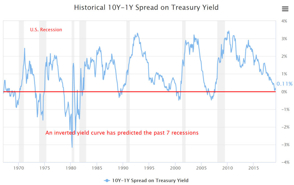
Whenever the curve cross the x axis, a recession follows a year or two later.
But what about home prices? Do they drop with every recession? According to the St. Louis Federal Reserve Bank’s website, you can see the Nominal Housing Price Index (not adjusted for inflation) for every state and county in the U.S. Below is the graph for California.
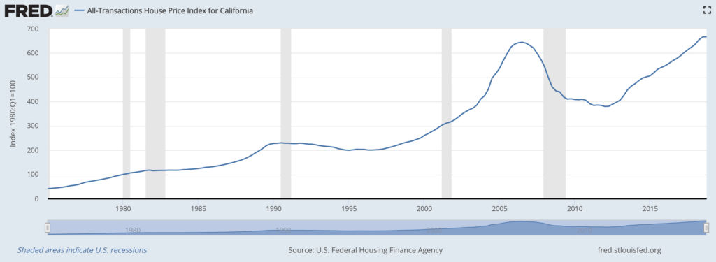
As you can see, nominal house prices only slightly dropped after the 1990 recession and immensely dropped during and after the 2008 recession. During and after all other recessions, nominal house prices increased either slowly and quickly. An understanding of the cause of the recession is necessary here as it will explain why house prices plummeted with the 2008 recession. According to InflationData.com, house prices skyrocketed after the 2001 recession because
- the government made it easier for everyone to buy a house by loosening lending practices
- the FED added artificially low interest rates
- lenders were lying and allowing people to buy houses they couldn’t afford with a very low down payment
- Wall Street created financial products that bundled high risk mortgage derivatives with low ones and sold them as low risk
In 2006, inflation didn’t keep up with the increasing house prices so people couldn’t afford the houses they shouldn’t have been qualified to buy in the first place. As a result, people began defaulting on their mortgages leading to the 2008 recession and huge drop in house prices.
The other recessions weren’t caused by real estate but rather other issues, e.g. the 2001 recession was due to the tech bubble. As such, home prices didn’t drop much, if at all, during and after those recessions.
When looking at the nominal housing price index graph above, it shows that the latest index value has exceeded the peak value during the 2008 recession. This might lead you to think that there’s another housing bubble that’s going to burst. However, that’s not necessarily the case since the graph doesn’t take into account inflation. The chart below compares the nominal housing price index (blue line) to one adjusted for inflation (orange line).
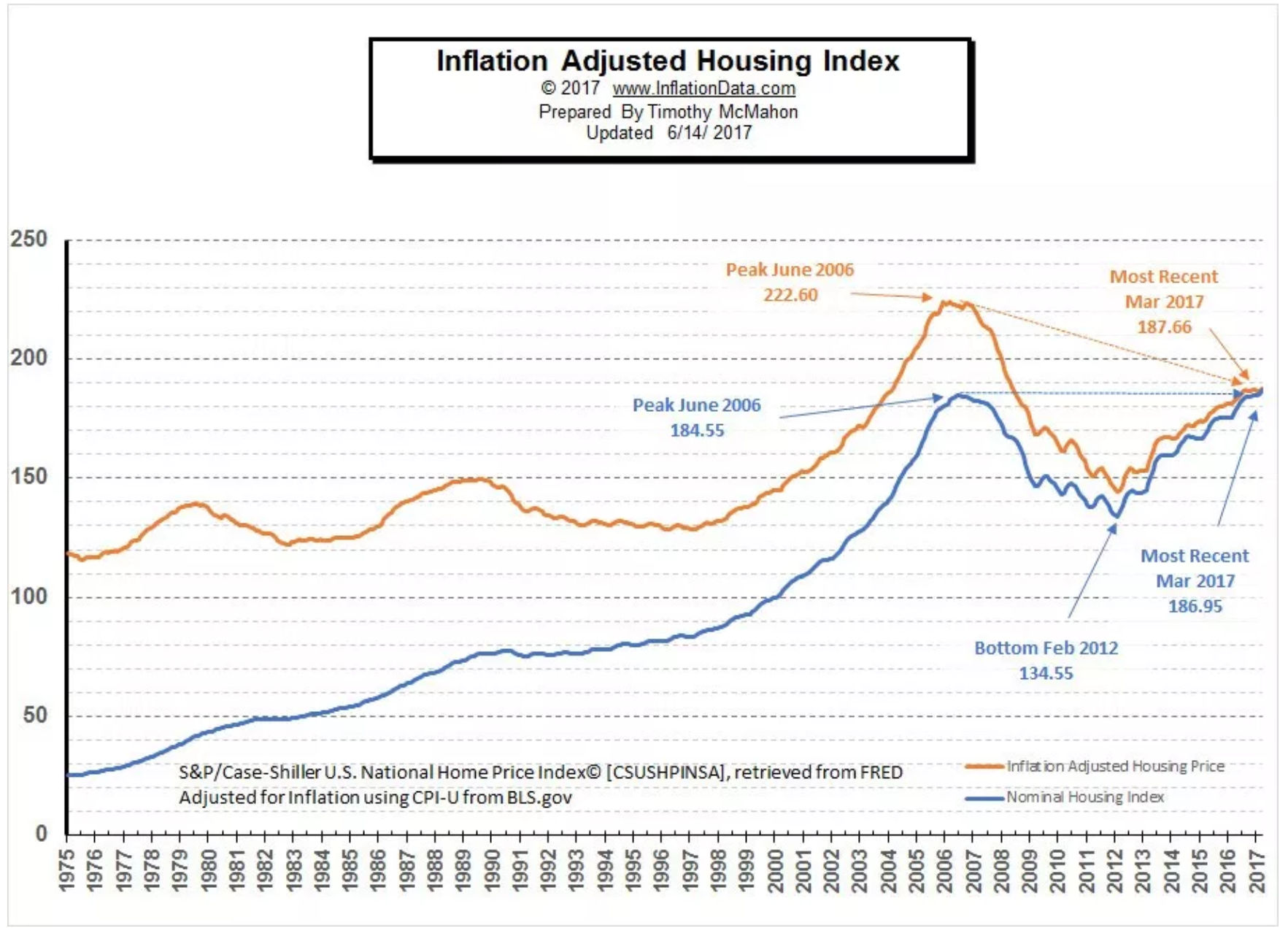
As you can see, though the nominal housing price index in 2017 exceeds the peak value during the 2008 recession (blue line), the same index adjusted for inflation shows that house prices are still far below the peak value during the 2008 recession (orange line). In other words, the housing market in 2017 hasn’t overheated like it did in 2008.
When looking at the yield curve spread above, it shows that another recession is looming. This is not unusual considering the 10 business cycle pattern of recessions approximately every 10 years. However, since the forces causing plummeting house prices to occur during the 2008 recession are no longer present due to higher lending standards among other things, it’s unlikely that house prices will plummet the same way they did in 2008.
Read more information regarding whether the real estate market will crash.
When will the next housing bust occur? According to the Cato Institute, the real estate boom bust cycle is every 18 years. Therefore, last bust was in 2008. Therefore, the next one will likely be in 2026.
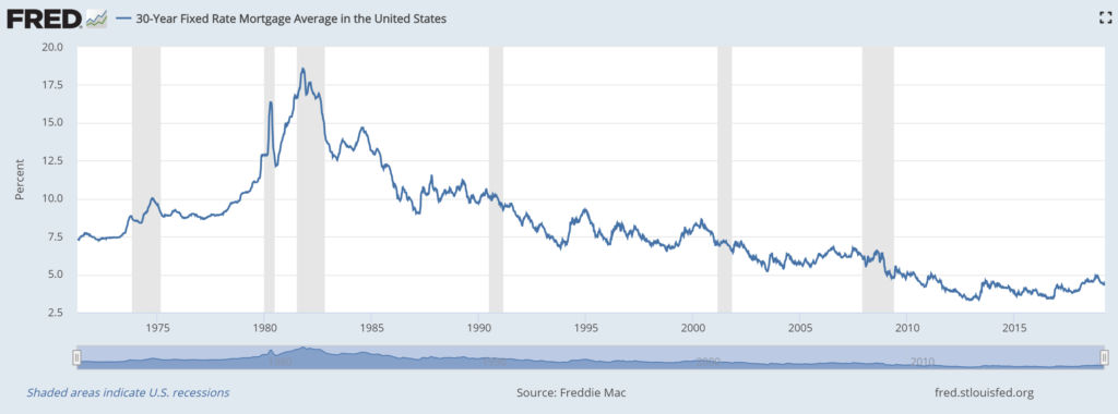
When buying a house, interest rates are also a key factor. As you can see in the graph below, interest rates are historically low.
For a $300,000 mortgage, the monthly payments for various interest rates and the total interest paid over 15 and 30 years.
- 3%
- 15 years: $2071 per month – $73K in interest
- 30 years: $1265 per month – $155K in interest
- 3.5%
- 15 years: $2144 per month – $86K in interest
- 30 years: $1347 per month – $185K in interest
- 4%
- 15 years: $2219 per month – $100K in interest
- 30 years: $1432 per month – $215K in interest
- 4.5%
- 15 years: $2295 per month – $113K in interest
- 30 years: $1520 per month – $247K in interest
- 5%
- 15 years: $2372 per month – $127K in interest
- 30 years: $1610 per month – $280K in interest
- 5.5%
- 15 years – $2451 per month – $141K in interest
- 30 years – $1703 per month – $313K in interest
- 6%
- 15 years: $2531 per month – $155K in interest
- 30 years: $1799 per month – $647K in interest
As you can see, the interest rate can make a huge difference in your monthly payments and the amount of interest you pay.