


Having a website without a reporting tool like Google Analytics (GA) is like flying blind. The data available is very useful, if not critical, in making business decisions. Yet, it surprises me how many people continue to make website changes based on pure assumption and without considering user behavior and traffic data at all.
Before looking at various reports, it’s important to understand some background information.
Terminology
- Pageviews: # of times a page was viewed, including by the same visitor.
- Unique Pageviews: # of times a page was viewed by unique visitor sessions
- Avg Time on Page: The higher the avg time on page, the more the user is engaged with the content. If pageviews is high but avg time on page is low, then people probably aren’t finding what they are looking for.
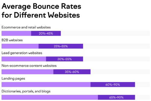
- Bounce Rate: A “bounce” is when someone lands on qualys.com from an external source and leaves without clicking on any internal links. They see only one page. Lower bounce rates are better, but a high bounce rate may be reasonable, depending on intent and context. For example, blogs tend to have higher bounce rates (70-90%)[1] than e-commerce/retail websites (20-45%)[2] because people read an article and leave whereas on retail sites, they tend to browse multiple product pages while shopping.
- https://www.smartbugmedia.com/blog/bounce-rates-blog-post
- https://www.semrush.com/blog/bounce-rate/
Visitor Intent
When interpreting data, it’s important to understand visitor intent.
- Informational: people intend to find an answer to a specific question or general information. If a blog post has a high bounce rate but high avg time on page, that is to be expected because people come for information and nothing more.
- Commercial: people intend to investigate brands or services. If people visit Qualys product pages, spend time reading the page, but bounce instead of sign up for a trial, that is reasonable if they are still investigating/comparing brands/products.
- Transactional: people intend complete an action or purchase.
- Navigational: people intend to find a specific site or page. If people come to the Qualys home page and the avg time on page is < 10 secs, that is to be expected if they know they are looking for a specific product page.
Channels (Traffic Source)
When interpreting data, it’s important to know where traffic came from.
- Direct: Source is unknown or visitor typed the URL directly in a browser
- Organic Search: Source is from non-paid search engine results, e.g. Google
- Paid Search: Source is from paid search engine ads, e.g. Google CPC
- Social: Source is a social network, e.g. LinkedIn, Facebook, etc
- Paid Social: Source is from paid ads on a social network, e.g. LinkedIn, Facebook, etc
- Email: Source is an email
- Affiliates: Source is an affiliate/partner
- Referral: The visitor came from some other website
- Display: Source came from ad distribution network, e.g. banner ads on some websites
- Other: Visitor came from some other source
https://support.google.com/analytics/answer/3297892
Page Analysis FAQs
Q: How do I know if people are finding a particular page?
A: If the page has many unique pageviews, then many people are finding it.
Q: How do I know if people are engaged in consuming the content of a particular page?
A: If the avg time on page is high, then we can assume people are engaged in it (reading, watching videos, etc).
Q: How do I know where people are finding a particular page?
A: Look at the page’s source / medium, e.g. Google / organic, Email, Social, etc
Q: How do I know what people are clicking on on a particular page?
A: Look at the page’s next page path (page flow).
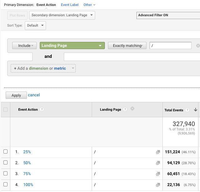
Q: One of my pages is long. The avg time on page is high but how do I know people are scrolling down to see the whole page?
A: Look at the page’s scroll depth. It will tell how what percentage of visitors see 25%, 50%, 75% and 100% of the page.
Now, let’s look at some reports in Google Analytics that are interesting and useful and that can be used to make data-driven decisions about website changes.
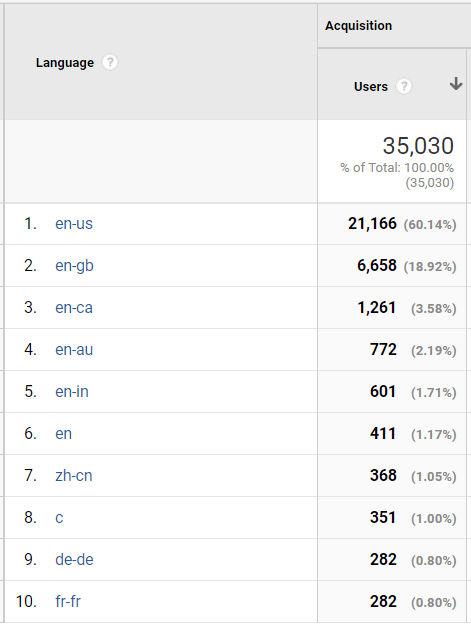
Audience > Geo > Language
Knowing what language your users speak can help you make a decision on which languages you should have your website in. GA gets language data from a user’s browser which are in specific language-country codes. en-US is English-US, en-gb is English-Great Britain, en-ca is English-Canada, and so on. In the screenshot below, we see that most users have their browser language set to some variant of English, but some (1.05%) have it set to zh-cn (Chinese-People’s Republic of China), de-de (German-Germany), and fr-fr (French-France).
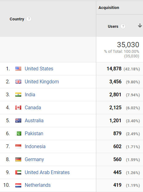
Audience > Geo > Country
Google Analytics tracks user location based on their IP address. It’s always interesting to see where your website visitors are viewing your site from. In the screenshot below, almost 8% of website visitors are in India yet, compared to the language report above, hi-IN (Hindi-India) wasn’t in the list. I guess people in India set their browser language to English (en).
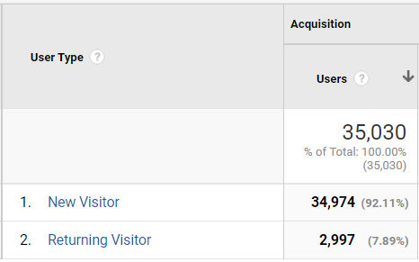
Audience > Behavior > New vs Returning
This report compares how many visitors are new versus returning. If many people are returning visitors to your website, then the website must have a lot of interesting content that makes them want to keep returning.
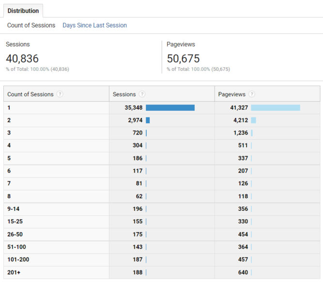
Audience > Behavior > Frequency & Recency
Frequency
If you click the “Count of Sessions” distribution, you will see how frequent the same individual visits your site in a given time period. For example, in the report below, 720 people visited the website 3 times (e.g. once a week over 3 weeks).
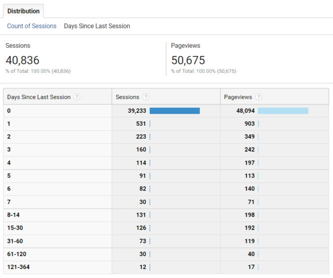
If you click the “Days Since Last Session” distribution, you will see how long it’s been since your visitors last came to your site in a given time period. For example, in the report below, it has been 2 days since 223 people last visited the website.
Recency
Audience > Behavior > Engagement
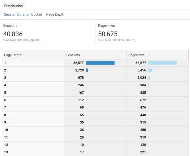
Session Duration Bucket
This report tells you how many visitor sessions are within a particular duration. For example, in the report below, there were 1204 visitor sessions that lasted between 601 and 800 seconds.
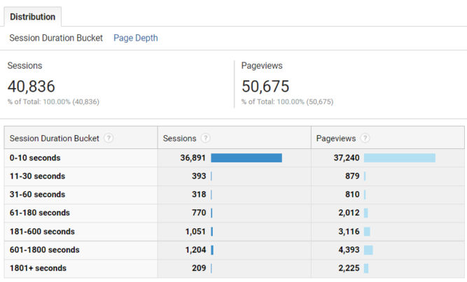
Page Depth
This report tells you the number of sessions where the page depth (number of pages visited) was 1, 2, etc. In the report below, there were 678 sessions where the visitors visited 3 pages during their session.
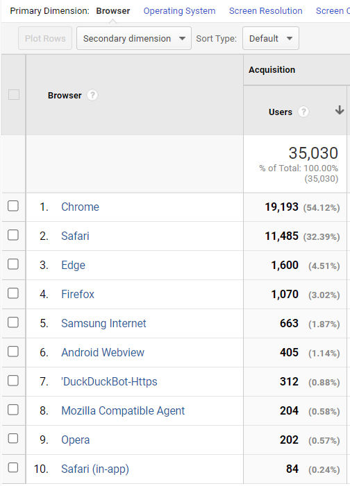
Audience > Technology > Browser & OS
Browser
In this report, you can see what percentage of users use a particular browser. In the report below, more than 50% of users use Chrome. So, if your website has a feature that is broken in Chrome, you should fix it. We also see that 0.58% of visitors use the Opera browser. So, if your website doesn’t work in Opera, who cares. Well, 0.58% of your visitors might care but so what.
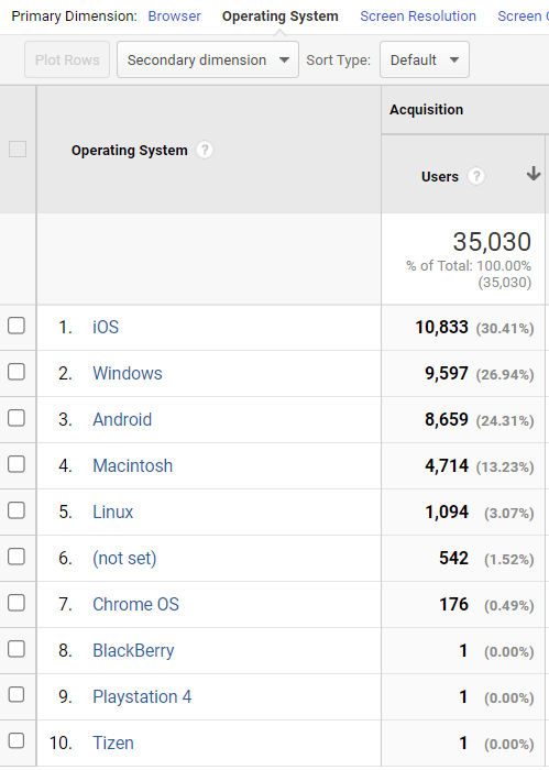
Operating System
In this report, you can see what percentage of your visitors use a particular operating system. In the report below, the majority of visitors (30.41%) visit the website on iOS.
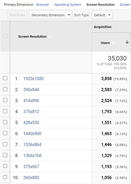
Screen Resolution
In this report, you can see what percentage of your visitors view your website at a particular screen resolution. In the report below, we see that 10.88% of people view the website on desktop at a resolution of 1920×1080. Many others view the site at screen widths below 500px. This means they are probably viewing the site on their phones. Notice how the smallest screen resolution is 360×800. In this case, you would want to ensure the mobile version of your site looks good at a width of 360 px.
Audience > Mobile > Overview
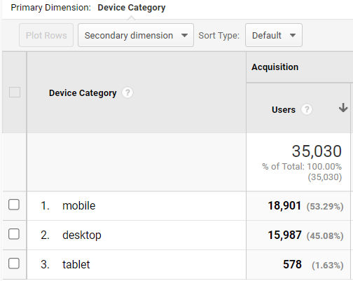
Device Category
In this report, we can see what percentage of people are visiting your site on mobile, desktop and tablet. In the report below, very few people (1.63%) view the site on tablet so ensuring the site looks good on tablet isn’t particularly important. However, the majority of visitors visit the site on mobile so it’s important to ensure the site looks good on mobile.
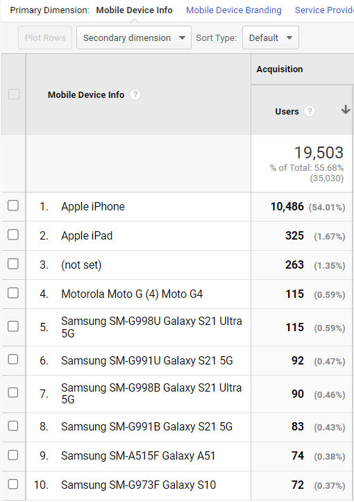
Audience > Mobile > Devices
In this report, we can see what percentage of people visit your site on a particular device (iPhone, iPad, etc). In the report below, more than 50% of the website visitors visit the site on mobile using an Apple iPhone.
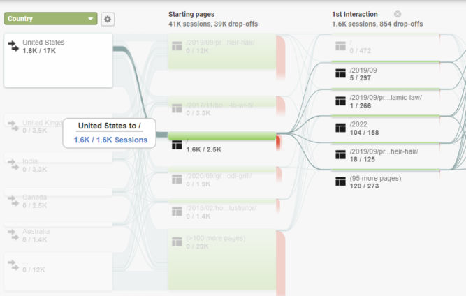
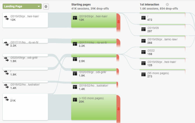
Audience > Users Flow
In this report, you can see how people flow through your site. The first column is the primary dimension. In the report below, the primary dimension is “Country”.
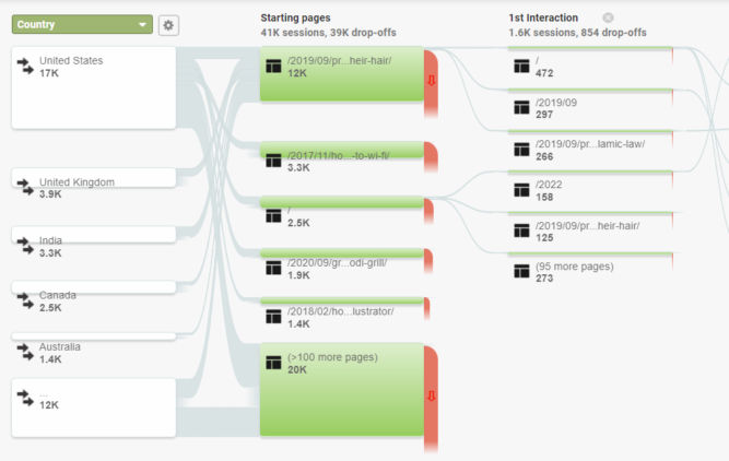
Of the 17K sessions from the US, 1.6K land (start) on the home page, and from there, they go to some other pages shown in the 1st Interaction column.
If we click another band, we can see that of the 17K visitors from the US, 1.7K land (start) on the blog post about grilling corn using a Ninja Foodi grill.
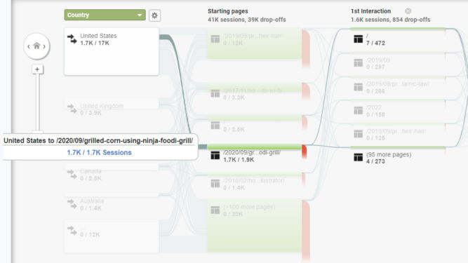
You can also change the primary dimension to something else like “Landing Page”.
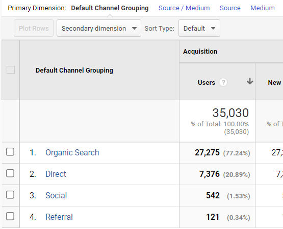
Acquisition > All Traffic > Channels
In this report, we can see what percentage of users visit the site from different channels (organic search, direct, social, etc). In the report below, 77.24% of visitors find the site from organic search, e.g. searching from Google.
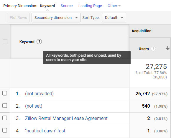
If you click “Organic Search”, you’ll see another report like the one below. The default primary dimension is keyword. Almost all of the keywords used to find the site in a search engine have value of “(not provided)” or “(not set)”. Obviously, this is incorrect because people must have searched for something to find the site in Google. The reason why it says “not provided” or “not set” is because Google decided to hide this keyword data to protect users’ privacy.
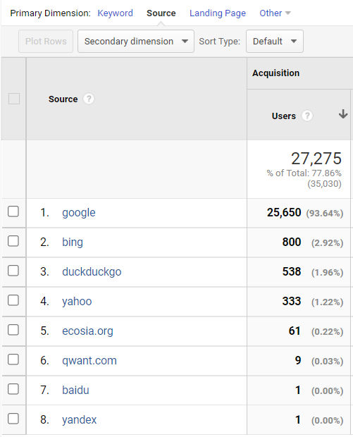
If you click on the “Source” primary dimension, you can compare visits by search engine. In the report below, clearly, the majority of visitors found the site from Google.
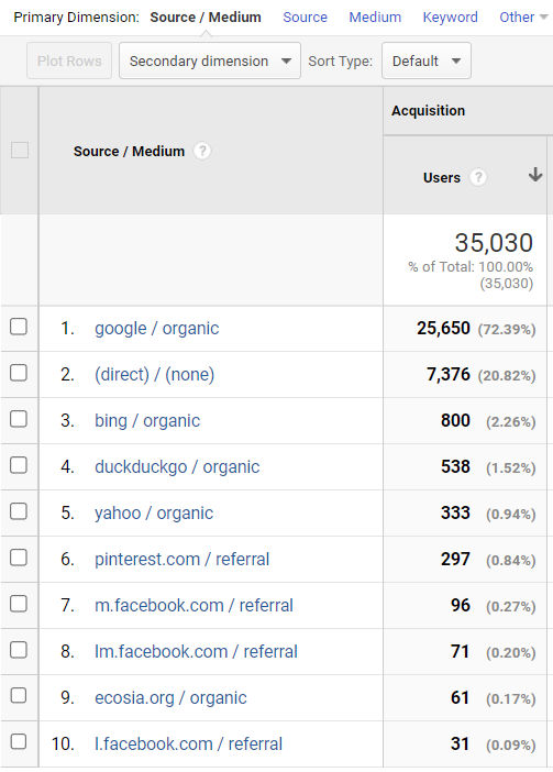
Acquisition > All Traffic > Source/Medium
Sometimes, it’s more helpful to see how people are finding your website by a combination of source and medium as shown in the screenshot below.
Behavior > Behavior Flow
This report is similar to the Users Flow report mentioned above. You can see how people flow / traverse through your website as they click from one page to another.
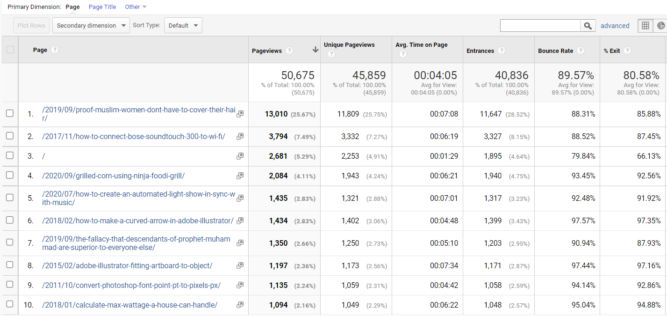
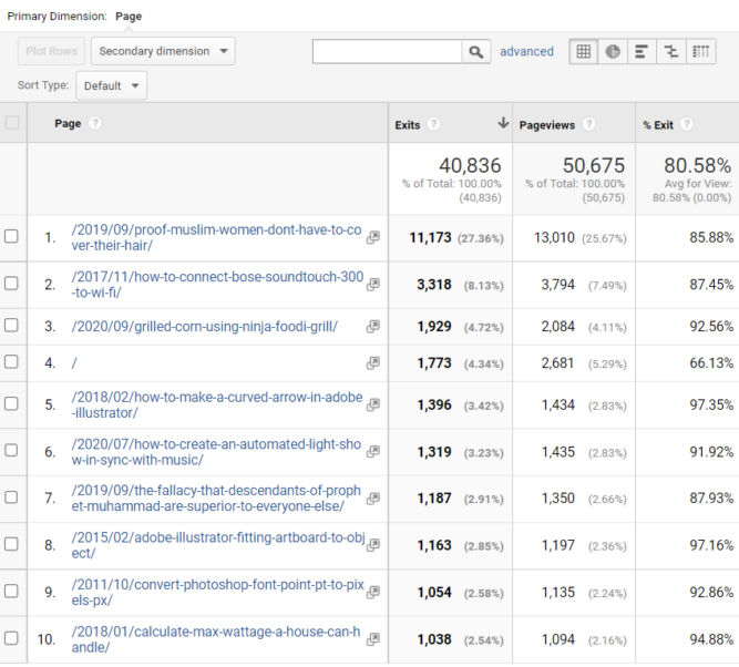
Behavior > Site Content >All Pages
When the primary dimension is set to “Page” (default), in this report you can see traffic and behavior by page, e.g. how many pageviews, unique pageviews, average time on page, entrances, bounce rate, and % exit a particular page got. This report clearly tells you your most visited pages.
Secondary Dimension
The secondary dimension option allows you to see reports in other ways. This is extremely useful. For example, let’s say you have a registration page and you want to promote it by linking to it from many places, both internally on the same website, e.g. on your home page or a product page, and externally on other websites.
Internal referrals
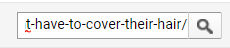
To find which pages on your website are generating traffic directly to a particular page on your website, first, type part of the page URL in the filter field and click the search button. This will filter out all other pages and only show the specific page you are interested in
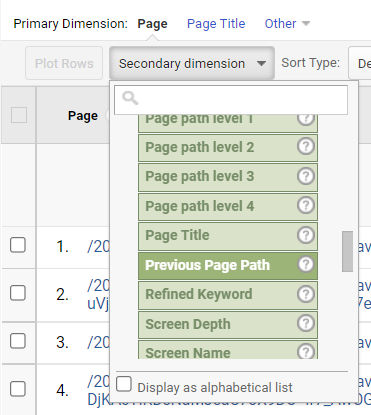
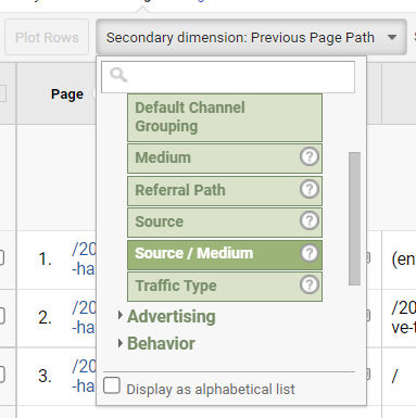
Then, in the secondary dimension dropdown, choose Behavior > Previous Page Path.
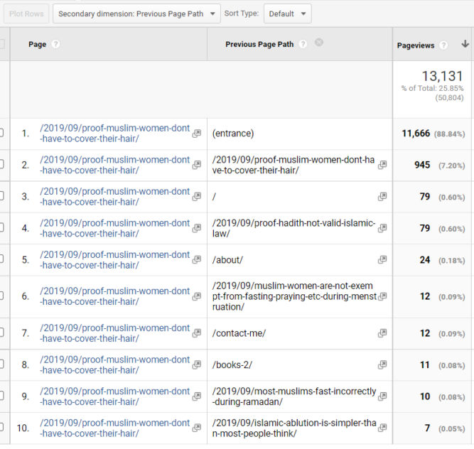
Now, in the resulting report (below), we can see that for the specific page we’re interested in, we find that 88% of people landing on that page (entered it from some other website like from Google search results). 0.6% got to that page from the home page and another 0.18% got to it from the About page.
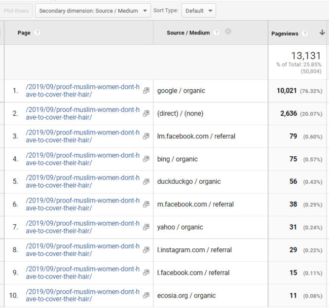
External referrals
To find how people got to that page from an external source, change the secondary dimension to Acquisition > Source / Medium.
Now we see that 76% came from Google organic search results and 20% directly, e.g. they typed the URL in from somewhere or clicked a link in an email.
Next Page Path
What if we want to know what pages people are getting to from, say, the home page? If we change the filter to just “/” (the home page) and set the secondary dimension to “Next page path”, we see the following report.
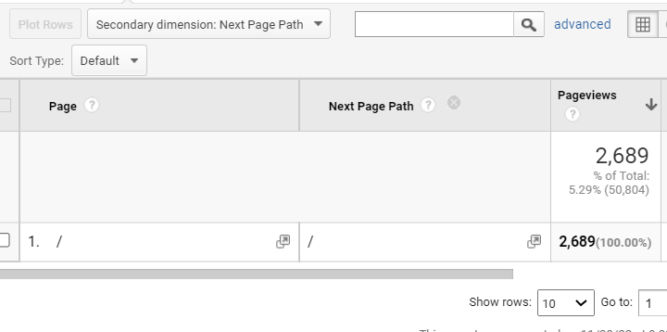
The report above looks wrong because it says that 100% of visitors went from the home page to the home page (next page). To find out the correct next pages, click the Navigation Summary tab.

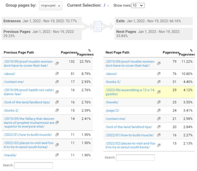
Now we can see what pages people came from before hitting the home page and what pages people went to after hitting the home page.
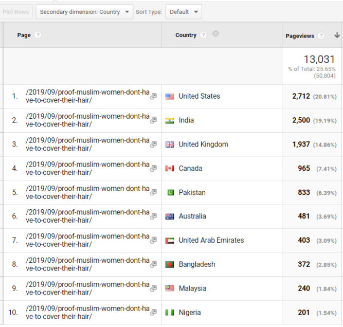
There are many other secondary dimensions so it’s worth spending time browsing the different types of reports you can get from other dimensions. For example, you can see how many people visited a specific page by country.
Behavior > Site Content >Content Drilldown
In this report, you can see pageviews (and other data) by folder structure (URL structure). For example, in the report below, there were 21,503 pageviews of pages in the 2019 folder (blog posts published in 2019).
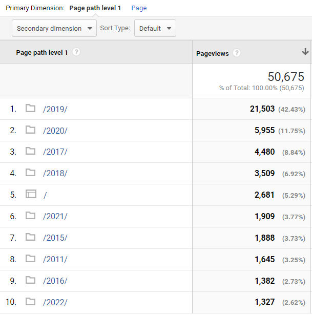
If you click a folder like /2019/, you can drill down to subfolders. In the report below, the subfolders are numbers indicating months. For example, in the report below, there were 18,267 pageviews to pages in /2019/09/.
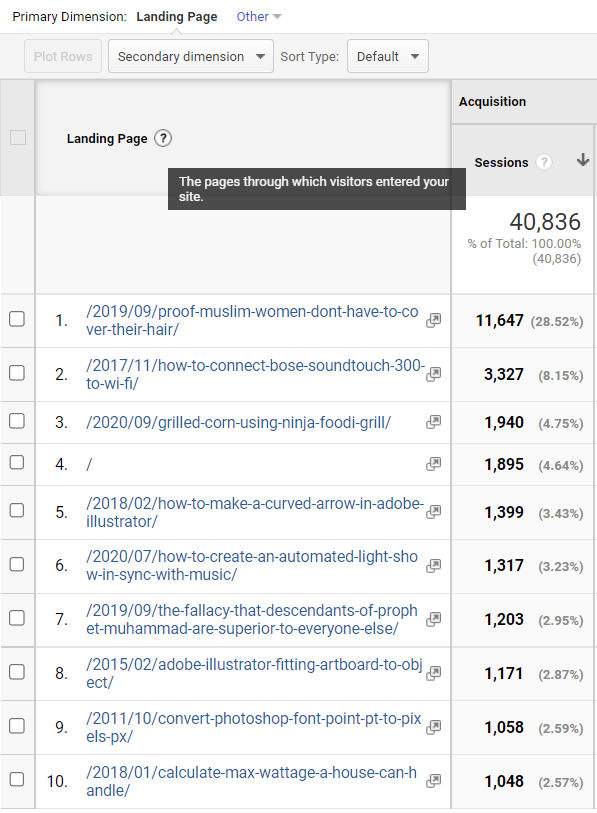
Behavior > Site Content >Landing Pages
This report is similar to the one under Behavior > Site Content > All Pages, but this one is specifically for landing pages, i.e., the pages through which visitors entered your site. You can think of “landing pages” as “entrance pages”.
Behavior > Site Content >Exit Pages
Opposite of landing pages is exit pages, i.e. pages from which people exited your site.
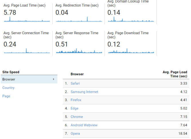
Behavior > Site Speed > Overview
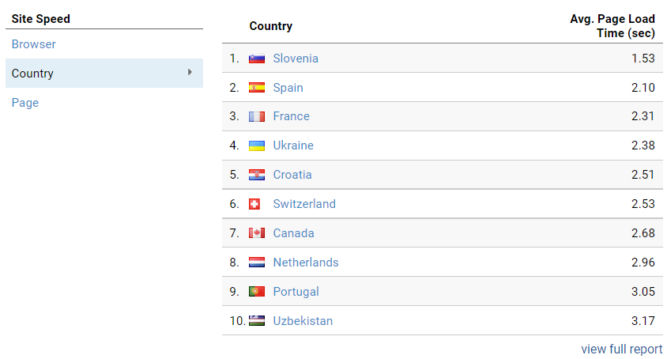
In this report, you can see how fast your website loads on average by browser, country, and page. Of course, you want your website to load as fast as possible. In the report below, we see that the average page load time is 5.78 seconds. Interestingly, the average page load time in Chrome is much higher (7.15 sec) compared to Safari (3.33 sec).
If we look at the average page load time by country, we see that the website loads the fastest (1.53 sec) from Slovenia for some reason.
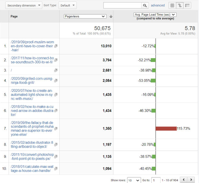
Behavior > Site Speed > Page Timings
In this report, we can compare the average page load time of individual pages against the site average page load speed. This is helpful to find specific pages that aren’t performing well, e.g. the one with the red bar in the screenshot below.
Behavior > Events > Top Events > Scroll
If you’ve added an event category of “Scroll”, you can see what percentage of people scrolled 25%, 50%, 75% and 100% down a page. In the example below, 46% of people only saw the top 25% of the home page and only 7% of people scrolled all the way to the bottom.